(Brit Insurance) Design Of The Year 2009
On the second floor of the Design Museum they were exhibiting the best work from the design of the year award. This award covered all forms of design and it was interesting to see what is seen as the best work from each field of design all at one place. All the work at this exhibition were inspiring in various forms.
Here are some photographs of my highlights from the exhibition:
Barack Obama Poster - USA
Designed by Shepard Fairley
Shepard Fairey is a street artist renowned for his prolific fly posting of propaganda style artwork and Obey the Giant Icon images and to date has attracted a large international following. Fairey was commissioned by the initiative 'Artist for Obama' to create a limited edition art work, to be sold to raise awearness for Obama's 2008 Presedential campaign.
Having seen how much cotrovesy was raised over this election it is inspiring to find how a designer can get involved in such a political campaign in a meanignful way and create such a positive response. This poster symbolised Obama's appeal to a younger audience and the sales of the poster has raised over over four hundered thousand dollars.
Kinetic Sculpture - Mechatronical Museum Instulation - BMW Museum Germany
Made by ARTCOM
This sculpture consisted of 714 metal balls suspended from thin steel wires, each individually controlled. Within a grid covering the area of six square metres, they appeared to weightlessly float in the air, rising and falling in an elegant and composed sequence. This sculpture looked amazing. Unfortunately they only had a video and one example of this sculpture in use. I can imagine that if I were to see this in real life (without knowing the technology behind the sculpture) I would have instantly attracted my attention because I would be trying to work out how it works. Pieces of design like this are a great way of attrackting annyones attention and it would be great to witness this sculpture in its full display.
Cloud - Terminal 5 Heathrow Airport UK
Concept and design by Trokia
This was an interactive art insulation very similar to the Kinetic sculpture that resembled a strong sens of design and engineering. Using flip-dot material which were more conventionally used in the 1970's and 80's to create signs in airports and train stations. Trokia have reinterpreted it's use to create this insulation piece. The flip-dots can be individually addressed by a computer to animate the entire skin of the sculpture. The dots silver on on side and black on the other, turn 180 degrees at a time and generate a sound reminiscent of travel as well as create a constant change in colour tonnes as the black and grey chase the across the surface.
Unfortunately they only had a small dummy example of this extravagant piece of sculpture at the exhibition. Never the less this version gave a great visual interpretation of how the final product would have been. This was a great example of how technology can develop a traditional piece of engineering and create the unthinkable. This had to be my favorite designs from the exhibition and it would have been great to see Cloud at its final form down at Terminal 5 in Heathrow Airport.
Wednesday, 29 April 2009
Thursday, 23 April 2009
Day in London - Design Museum - Hussein Chalayan (Part 4)
Having visited the Tate modern we then made our way over to the Design Museum.
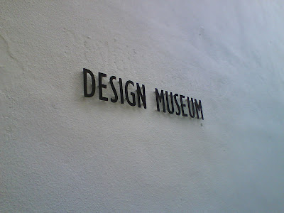
From the minute we arrived at the Design Museum I could detect that this was going to be a different experience to the traditional work shown at the Tate Museum. The outer buildings and the museum identity made a clear statement that this museum followed a modernist approach.
The museum currently had two exhibitions on display covering two floors of the museum. The first floor was exhibiting the work of contemporary fashion designer Hussein Chalayan.
This exhibition was the first comprehensive presentation of Hussein Chalayan’s work in the UK. Spanning fifteen years of experimental projects, the exhibition explored Hussein Chalayan's creative approach, his inspirations and the many themes which influence his work such as cultural identity, displacement and migration. Here are some photographs that I took from this exhibition:
I don't normally have a particular interest in fashion but this exhibition managed to draw my attention. Hussein Chalayan has a very industiral approach to his fashon design. The way that he develops technology into his work creates in some ways futuristic clothing. The influence that I gained from this experience were the fact that Chalayan has a clear understanding of his surroundings (out side fasion design) and brings in influences from modern materials/technology into his designs. General awearnes is something that all designers should have a strong understanding of and Chalayan is a great example of someone who has exploited his awearnes within his work.
Wednesday, 22 April 2009
Day in London - Tate Modern2 (Part 3)
As well as visiting the 'Defining Constructivism' exhibition we also had a look around the other exhibitions currently on display at the Tate modern gallery. There were numerous of work by various artists on display in the gallery and some work influenced me more than others. Here are examples of my highlights from the gallery:
Contemporary Painting
Albert Oehelen - Loa (2007)
Mark Bradford - Los Moscos (2004)
Both these pieces were very inspiring in very different ways to each other but my favorite would have to be Los Moscos. I understand that my background is of a design practice which might lead me to have stronger opinion of design over art. Having visited the Tate my opinions of modern art are slightly worrying because it seems that all that modern art has become are forms of design, the only exceptions are that the work has less meaning and purpose and has been hand crafted. Never the less I fully appreciate the work produced but feel that the work would fit better under the title of Illustration/ Design rather than Art.
Day in London - Tate Modern1 (Part 2)
The first location that we visited was the Tate Modern gallery. The Tate were currently exhibiting 'Defining Constructivism' by Rodchenko and Popova. Constructivism was the fundamental element that created what has become modernist design today. Having written my contextual essay earlier this year titled 'Swiss influence on Modern Graphic Design' I have grew a particular interest to the disciplines developed over the early period of design, making this exhibition my highlight of the day.
The Constructivism movement began during the Russian Revolution and questioned the fundamental properties of Art and asked what it's place should be in the new society. The Constructivists challenged the idea of the work of art as a unique commodity, explored more collective ways of working, and looked at how they could contribute to everyday life through design, architecture, industrial production, theatre and film. Liubiov Popova and Aleksandr Rodchenko were pivotal figures in the debates and disucssions that defined Constructivism.
Here are some of my highlights from the exhibition:Rodchenko - Construction 108 (1920)
These images make no justice to the craftsmanship used to produce these paintings. These symmetrical shapes may seem point less today but if you look back at when they were made these would have been important experimental constructions that has led design to were it is today. To many people take design methods for granted and forget that some one at some point in time has created a reason for all the skills that we use in practice today.
Popova - Space force Construction (1921)
Another example from the collection which is experimenting with the depth of field. Again it is hard to except the purpose of this image without seeing it in the flesh. This painting was made using thick layers of paint which caused the black structures ascend from the canvas. My appreciation for these paintings has changes dramatically since visiting this exhibition. I found the attention to detail very inspiring. Here is a quotation I found on the exhibition wall by Rodchenko about his paintings.
"When I look at the number of paintings I have painted, I some times wonder what I shall do with them. It would be a shame to burn them, there are over ten years of work in them. But they are as useless as a church, they serve no purpose what so ever."
(Rodchenko - Novyi Lef No.6 1927)
If only Rodchenko had lived today he could have seen how these images helped to visualise the world within design as we see it today.
Finally there were a series of Russian Revolution poster designs which again were all hand drawn/painted or screen printed. Here is an example of my favourite design from the collection.
Rodchenko - Battleship Potemkin (film poster)
Created by Sergei Eisenstein 1925
The poster design were just as striking as the paintings. The poster designs appealed visually more interesting but I fell that the reason for this is that it had a stronger relation to the discipline that I practice. The posters were amazing and I cant even imagine how it would be if we had to hand draw the text and imagery like they did back then. The main inspiration that I gathered from this exhibition is to take attention to detail and be passionate about my design. Today the design industry depends on the technology of computers. I would love to try and produce a traditional approach in my design.
Tuesday, 21 April 2009
Day in London (Part 1)
16.04.09
Last week me and a couple of friends decided to visit London to gather some inspiration from the local galleries / Museums. On our travel we visited three locations, which were inspirational in their own ways. First we visited the Tate modern who were currently displaying 'Defining Constructivism' by Rodchenko and Popova. We then moved on to the Design Museum before visiting the Absolute Vodka Ice bar. Each location that we visited were inspiring in different ways, there fore I have decided to create separate post for each location. Here is an image of some of the materials that I collected along the way.
Monday, 20 April 2009
My fontstruction (Tanc typeface)
Over the past week I have been playing with the fontstruct web site. Fontsruct is a site connected to the font shop web site which famously sells typefaces online. This site was created for typographers to experiment using block based patterns to create new fonts. The best feature of this site is that you can then download your typeface for free, which can be used as a real font. This web site has a community within the site and people can share fonts and also receive feedback about their work. I found this website inspiring from the word go and decided to get my self involved. Here are examples of my first fontstruct typeface called TANC available in full upper and lower case.
This typeface is an open source and any one is open to download this typeface I've created for free. I believe that for a first attempt this typeface came out fairly well. My aim creating this typeface was to develop a stronger understanding of the techniques used to produce a new font. It's an added bonus to be able to use my type in person after creating the font. This was an enjoyable process which I would love to encounter again in future. I'm also looking forward to any feed back that I may receive from the professionals on the sight.
Here's a Link to my typeface: http://fontstruct.fontshop.com/fontstructions/show/168676
Wednesday, 8 April 2009
Umdnb logo design
Here is a logo design that I created earlier this year for the University of Manchester Drum and Bass society. I would have normally gone for more of an urban approach with graffiti influences in this design but I was advised to create a logo that would appeal to an unisex audience there fore I took a subtle approach to the design. I produced a series of logos for the society but this version shown above is what the society selected as a final design. This logo was designed as a brand identity for the society which is used on the membership cards. This logo has also been used on numerous fliers and posters for music events around Manchester which have been associated with the society. I was happy with the final result but felt that this example below was a stronger choice because of it's landscape shape. Logos naturally tend to be in this shape and I realized shortly after giving the society the logo that there were many situations were other designers had made the logo very small to fit on fliers making it hard to identify. This example below would have been easier to identify because the main feature of the logo is the text rather than the image. Over all I really enjoyed this brief and feet that It was a big learning curve, working alongside the consumer to find a final conclusion. It's also a bonus to see my logo around town which inspires me to work with more logo design in future.
Thursday, 2 April 2009
Hort
Some more foreign inspiration. This time from Hort design based in Berlin. I particularly like these two brand identity poster designs shown below. The first is for the launch of a Witness campaign by Nike promoting the tour of famous basketball player LeBron James. The second poster is for the Berlin music commission. I like the bald use of colours and type to create a simple but effective design.
Helom
Some examples of inspiring contemporary design coming from French design agency Helmo!
This pieces particularly took my interest because there are some clear use of a structured grid within these poster designs(especially the one on the right) but they still look visually abstract.
These portraits created for a Jazz concert are very interesting. The idea of two images placed over each other in this circumstance creates a very strong portrait piece. I might consider a similar approach for my Tribute poster for boxer Joe Calzaghe, which I'm currently working on. Helom have numerous projects which are very interesting to look at but unfortunately all the brief descriptions are in French on their web site which is a shame.
For more examples of their work please visit: www.helmo.fr
Wednesday, 1 April 2009
Si Scott - Lecture series 5
Si Scott 24.03.09
Illustrator / Typographer Si Scott visited and gave an insight to his career as a designer. Scott's career began when he received a DN&D award for his third year final project at university. In his erlier study as a designer Scott had a perticular interest in creating imagery out of type and creating his own fonts. For his final project Scott made a screen printed pull out poster about the history of Northen Soul Jazz music, which then folded into a seven inch vinyl sleave.
Recieving this award gave Scott a placement opportunity at Vince Frost design agency which lasted three months before he began working freelance. By creating some contacts over design blog's Scott soon found him self selected to exhibit his work in Tokyo which later led onto another solo exhibition in London.
These exhibitions gave Scott the opportunity to work with some majour brand identeties such as Orange Mobile phones and PSV football club. Scott's work today is promenantly made hand drawn and then scaned and edited on the computer.
Scott has a perticular attention detail within his work and finds inspiration from work produced by other designers using a more traditional approach.
I perticularly enjoyed this lecture, Si Scott took a much less formal approach to the lecture making it a more appealing aproach for the listener. All his work was very inspiring but I found a perticular interest in his final year project whilst at university. Luckely Scott baught a copy in and I was fortunate to have a closer look after the lecture. It was interesting to see how his style of work had changed so maraculously since leaving university.
For more examples of his work visit: http://www.siscottstudio.com/
A walk in the forest?
Yesterday I went for a walk in a closed down slate quarry near my house in north Wales. Whilst at school I made a series of panoramic photographs of a man made forest made in fields near the quarry. I decided to take my camera with me to photograph what might have changed there over the last three years whilst I have been at Manchester. To my surprise most of the trees have all been cut down. What used to be a beautiful piece of countryside has now become a industrial site with man made roads running through the forest and tree stumps every where. My intentions were to create similar panoramic photos again but after finding the state of the place I decided to take some still photographs to show the extent of the damage caused to the forest.
Paul Farrington - Lecture series 4
Paul Farrington 17.03.09
Founder of Studio Tonne design agency Paul Farrington came to talk about his experiences within the design industry. Studio Tonne is a multi discipline agency but specialize in interactive web based design. Farrington showed examples from his portfolio of work, which were predominantly interactive design pieces evolving round design to visualize sound and music.
My passion for music led me to find this lecture particularly interesting. I would like to have the opportunity to work on a brief surrounding my musical inspirations within design. I would also be interested in developing my design abilities around Interactive design in future.
For more information on Studio Tonne please visit www.studiotonne.com
Subscribe to:
Posts (Atom)